
October 18, 2026
ReadyTools Workspace Adds Databases and a Daily Today View
Explore how Workspace Databases organize connected records, while the Today block brings daily priorities into view alongside other Workspace tools.
Cikk elolvasása
Blog cikk
Discover the importance of color palettes in design! Learn how they boost brand identity, create visual harmony, and enhance user experience for stunning, cohes
laszlo
January 22, 2025
10 perc olvasás
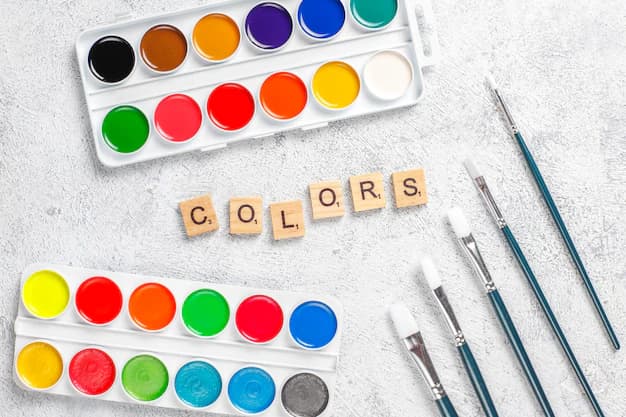
Image source: img.freepik.com
Megosztás
Color palettes are the foundation of effective design, influencing how users perceive and engage with visual content. A well-designed color scheme can elevate a simple design into an captivating visual experience that grabs attention and encourages interaction.
In this guide, we'll explore the crucial role that color palettes play in contemporary design. We'll discuss:
The strategic use of color palettes impacts every aspect of design - from establishing brand identity to improving user experience. With tools like ReadyTools Color Palette, designers can harness the power of color psychology and create visually stunning designs that resonate with their target audience.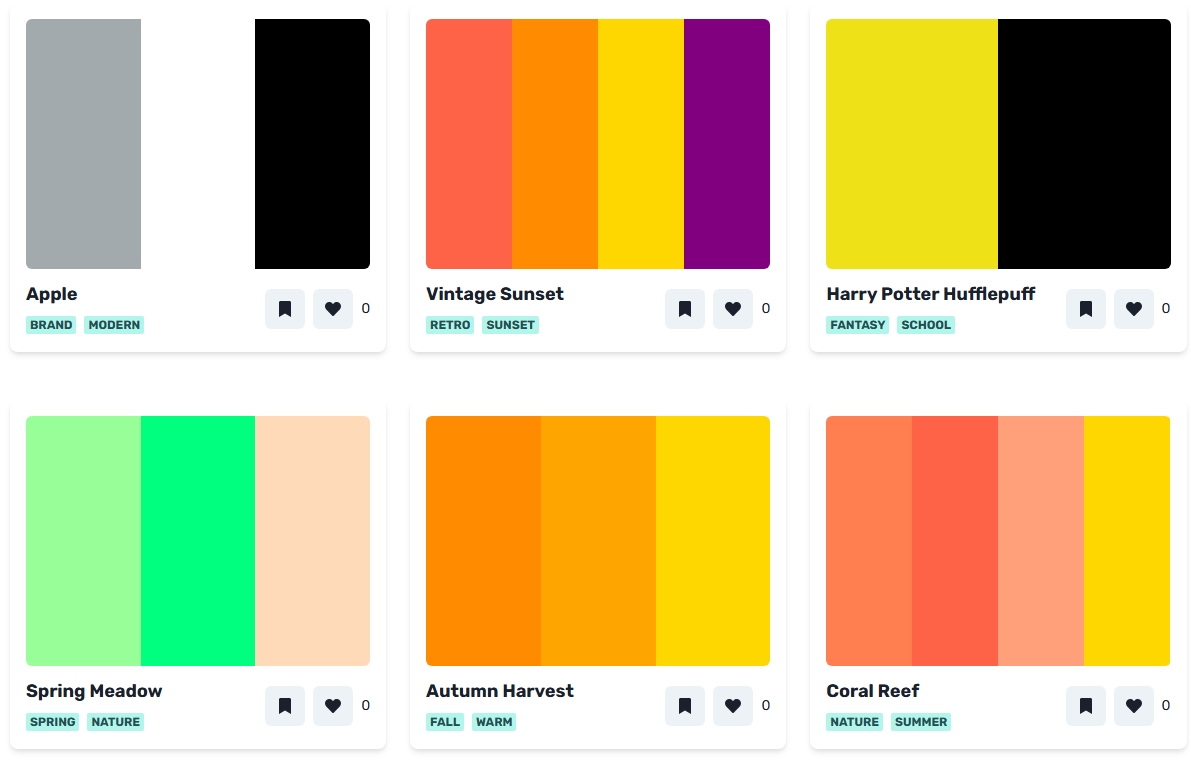
ReadyTools Color Palette
Are you ready to discover the potential of color in your design projects? Let's explore the transformative power of carefully selected color palettes and learn how they can enhance your creative endeavors.
Color palettes are essential in visual design. They create a sense of harmony that attracts and involves users. When used effectively, a carefully chosen color scheme can elevate simple designs into captivating visual experiences that leave a lasting impact.
Colors have a deep psychological effect on people. Color psychology in digital design reveals how different hues can evoke specific emotions:
These emotional connections can influence how users behave and how engaged they feel. In fact, research indicates that up to 90% of quick judgments about products are based solely on color.
When selecting colors for your design, it's important to strike a balance between looking good and serving a purpose:
To create an impactful color palette, consider the following:
The right combination of colors can speak directly to users both consciously and subconsciously. By making intentional decisions about your color choices, you have the power to transform ordinary designs into powerful tools for communication that drive user engagement and help achieve business goals.
Colors speak a universal language that transcends words, triggering specific emotional responses and conveying powerful messages to your audience. Each color carries its own psychological weight:
Leading brands harness these emotional connections through strategic color choices. Netflix's bold red creates a sense of excitement and entertainment, while Facebook's blue palette builds trust and reliability. Apple's minimalist white aesthetic communicates sophistication and innovation.
Your color choices directly influence user behavior and brand perception. Studies show that up to 90% of snap judgments about products stem from color alone. Consider these successful brand-color associations:
The psychology of color extends beyond individual hues. Color combinations create deeper emotional resonance - complementary colors generate energy and excitement, while analogous colors produce harmony and peace. Your brand's color story shapes user experiences, builds emotional connections, and drives engagement with your design.
Color choices directly impact how users interact with your design. A well-planned color scheme creates an intuitive, accessible experience for all users, including those with visual impairments.
Strategic color implementation guides users through your design's hierarchy. Key interactive elements benefit from distinctive colors that stand out from the surrounding content. This visual differentiation helps users:
Color accessibility extends beyond contrast ratios. Consider implementing patterns or textures alongside colors to convey information. This approach ensures your design remains functional for users who experience color blindness or other visual challenges.
Incorporating resources such as the ones found in this comprehensive guide on color accessibility tools can further enhance your design's inclusivity. ReadyTools Color Palette simplifies the process of choosing accessible color combinations that maintain both aesthetic appeal and functional clarity. The tool's built-in contrast checker helps you create designs that work for everyone while preserving your creative vision.
Moreover, it's essential to remember that visual treatments play a significant role in accessibility as well.
A limited color palette brings clarity and impact to your designs. Using 2-3 main colors creates a strong visual identity while simplifying decision-making during the design process.
The 60-30-10 rule provides a structured approach to color distribution:
This minimalist approach prevents visual overwhelm and ensures consistency across your project. You'll notice successful brands like Apple and Nike embrace this principle - Apple pairs white with gray and adds minimal accent colors, creating their signature clean aesthetic.
The ReadyTools Color Palette generator helps you implement this rule by suggesting balanced color combinations. When selecting your palette, start with your dominant color and work through the proportions:
This systematic approach to color selection creates professional, cohesive designs that maintain visual harmony while effectively guiding user attention.
Colors have different meanings in different cultures. A color that represents happiness in one place might signify sadness in another. This cultural diversity requires careful thought when designing for international audiences.
The success of global brands shows how important it is to understand cultural meanings of colors. McDonald's changes its usual red and yellow colors in different countries. In Europe, they often use more subdued greens and earth tones to match environmental awareness and local tastes.
Companies like Coca-Cola show how to successfully adapt colors to different cultures. Their well-known red color stands for happiness and celebration in many places, but they also change packaging colors for special editions and local festivals, making stronger connections with diverse audiences.
Understanding these cultural differences helps create designs that genuinely connect with your target audience, avoiding unintended negative meanings while fostering meaningful relationships across cultural boundaries.
Usability testing is crucial for confirming that your color choices work well. With ReadyTools Color Palette, you can test your chosen colors on various devices and screen sizes to ensure they look good everywhere.
ReadyTools Color Palette also includes accessibility features to assist users with visual impairments:
Your testing process should involve:
ReadyTools Color Palette makes this process easier by offering:
The tool's real-time preview feature allows you to make instant changes while keeping the colors balanced, saving valuable development time during the iteration process.
Your design journey starts with the right color choices. ReadyTools Color Palette equips you with the essential features to create stunning, harmonious color combinations that resonate with your audience.
Ready to transform your designs? Here's what you can achieve with ReadyTools Color Palette:
The path to exceptional design lies in experimentation and creativity. ReadyTools Color Palette gives you the freedom to explore different color combinations while maintaining professional standards and accessibility guidelines.
Ready to elevate your design game?
Try ReadyTools Color Palette now and discover how the right color combinations can bring your creative vision to life. Your next remarkable design project awaits – let ReadyTools Color Palette be your trusted companion in this colorful journey.
Color palettes play a crucial role in design by creating visual harmony and enhancing the overall aesthetics of a project. Well-chosen colors can significantly impact users' perception and engagement, making it essential to consider both aesthetics and functionality when selecting colors.
Different colors can convey specific messages and evoke particular emotions in users, shaping brand identity and influencing user behavior. Brands that utilize colors effectively establish a strong market presence, as seen in various successful examples across different industries.
To enhance usability, it's important to ensure sufficient contrast between text and background colors for optimal readability. Additionally, strategic use of color can guide users through a design, improving navigation experience and overall user interaction.
The 60-30-10 rule is a technique for achieving a cohesive look with a limited color palette. It suggests using 60% of a dominant color, 30% of a secondary color, and 10% of an accent color to create balance and visual interest throughout a project.
Cultural context is vital when designing for global audiences because different hues carry varying interpretations and associations across cultures. Being mindful of these cultural significances can enhance audience connection and ensure that designs resonate well with diverse markets.
Conducting thorough usability testing with real users is essential to ensure your chosen color palette works effectively across various devices or screen sizes. This process should also consider accessibility for individuals with visual impairments to guarantee an inclusive user experience.
Fedezd fel a ReadyTools-t: a tökéletes produktivitási csomagot alkotók számára. Gyönyörű Linksy oldalak, intelligens Lara AI, projektmenedzsment, biztonságos felhőtárhely és minden más, amire szükséged van — mind egy helyen. Kezdd el a 7 napos ingyenes próbaidőszakot még ma.
ReadyTools felfedezéseTartalomjegyzék
Olvasd tovább
October 18, 2026
Explore how Workspace Databases organize connected records, while the Today block brings daily priorities into view alongside other Workspace tools.
Cikk elolvasása
October 11, 2026
Learn how to add a Canvas block in ReadyTools, sketch ideas, build diagrams with Lara, embed files, collaborate, and export your work.
Cikk elolvasása

October 6, 2026
the platform has continued moving from individual API endpoints toward something much closer to the infrastructure we originally wanted to build.
Cikk elolvasása